
Shadcn UI unlocked a new wave of practical, composable UI for React + Tailwind teams. On top of that foundation, a thriving ecosystem of libraries has emerged—some focused on polished blocks and sections, others on motion-heavy micro-interactions, and a few offering full component coverage with a consistent design language.
Below are my top picks. Each entry includes a rating, quick summary, ideal use cases, and clear pros/cons to help you choose fast. I’ve also included one “bonus” pick at the end so you don’t miss a great option that didn’t quite fit the original top 11.
Note: Links can change over time—search for the library name plus “shadcn” to find the latest docs and repo.
How I evaluated these libraries
- Shadcn alignment: Works cleanly with Shadcn UI and Tailwind
- Implementation quality: Clean code, accessibility, and reasonable APIs
- Design cohesion: Visual consistency and practical defaults
- Motion quality: If animated, smoothness and performance
- Practicality: How quickly you can ship real UI with it
1) Reui — Solid building blocks
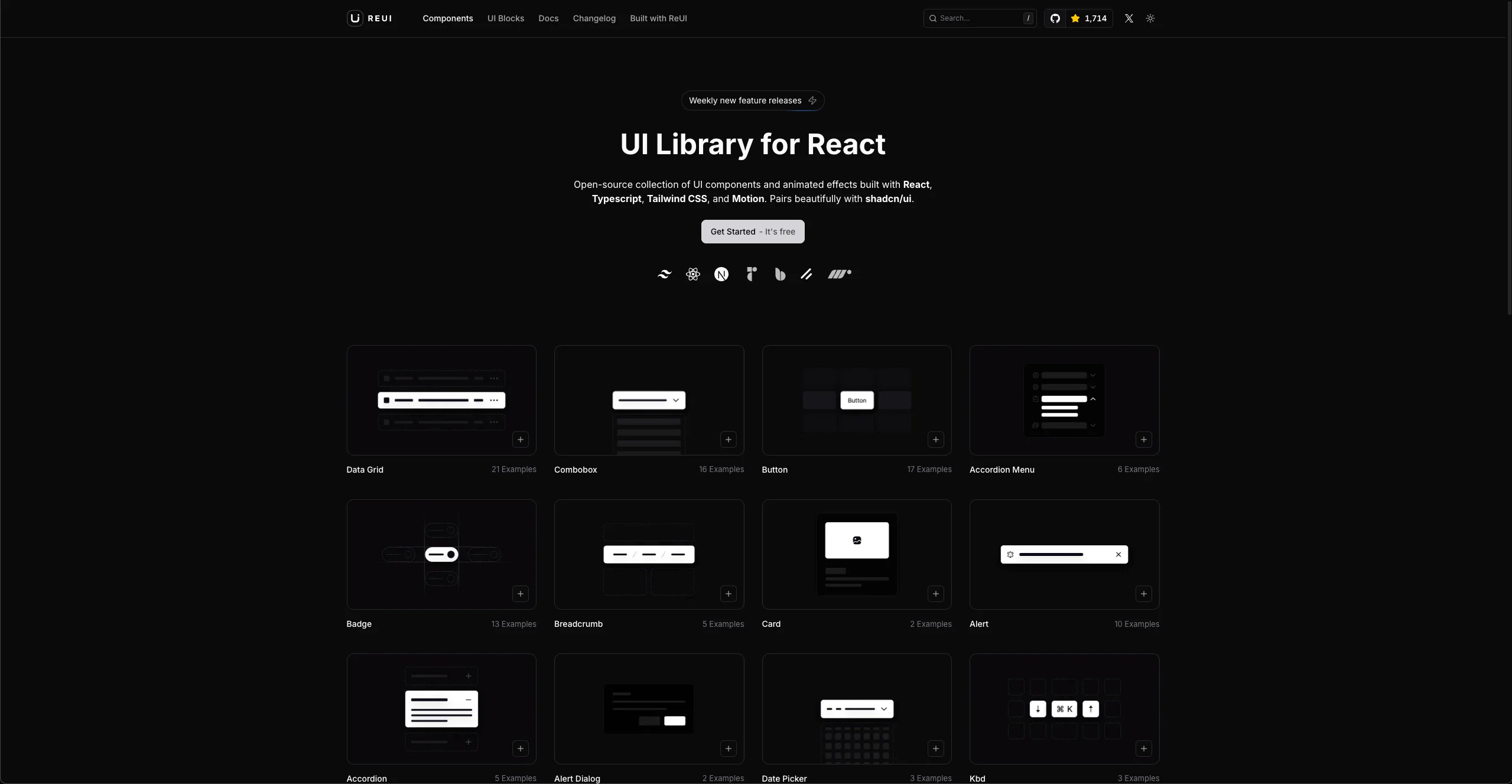
Rating: 8/10
A component library built on Shadcn UI with Tailwind, React, Radix, and tasteful Motion-driven variants. Focuses on clean, foundational components and useful variations.
Teams that want Shadcn-consistent components with just enough polish to ship quickly.
Pros
- Powerful, well-built components
- Team ships new features weekly
- Offers both components and UI blocks (sections)
- Integrates smoothly with Shadcn UI
Cons
- More foundational than flashy
- Not as many advanced components as larger kits
- Variations center on Shadcn patterns
- Animations aren't the primary focus
2) TailArc — Beautiful sections you can drop in
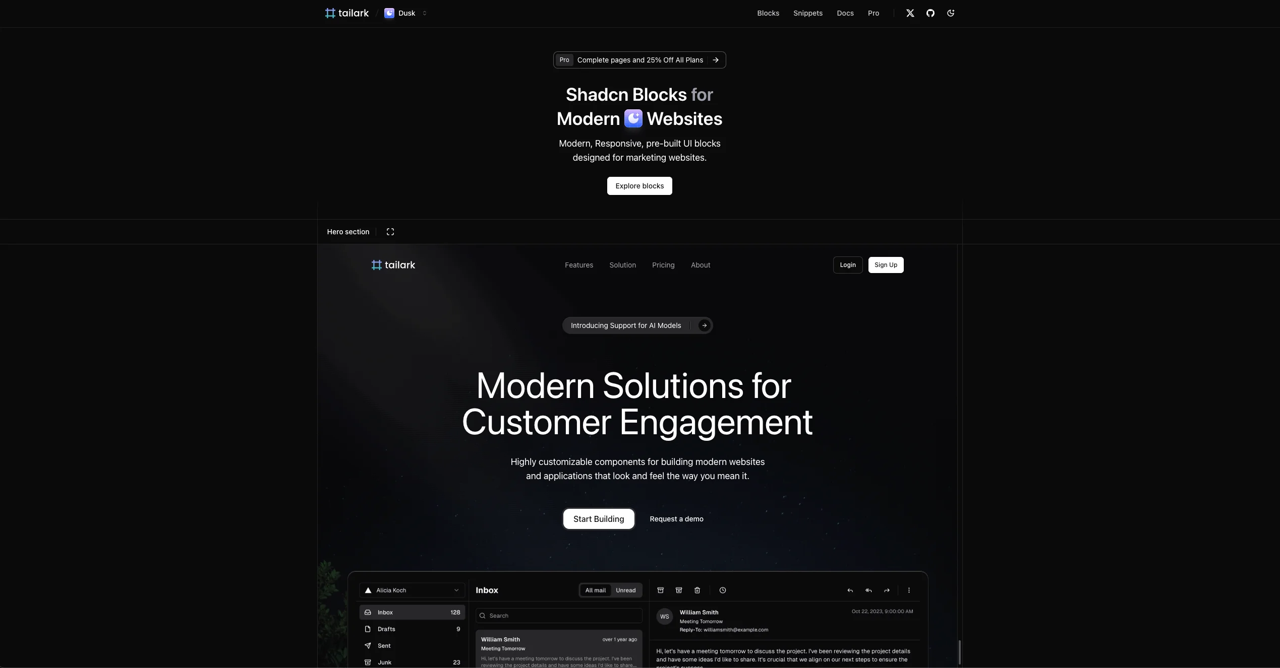
Rating: 9/10
Premium-feeling, responsive sections and blocks for modern websites. Two themes: "dusk" (animated) and "mist" (minimal).
Marketing sites, landing pages, and product pages where aesthetics and speed-to-ship matter.
Pros
- High-quality, pre-built sections
- Excellent animations in the "dusk" theme
- Clean, accessible code
- Two clear themes to choose from
Cons
- Fewer individual components; emphasis on sections
- "Mist" theme is intentionally low on motion
- May require customization beyond the provided blocks
- Aesthetics-first focus may not fit every product
3) Motion Primitives — Smooth, focused interactions
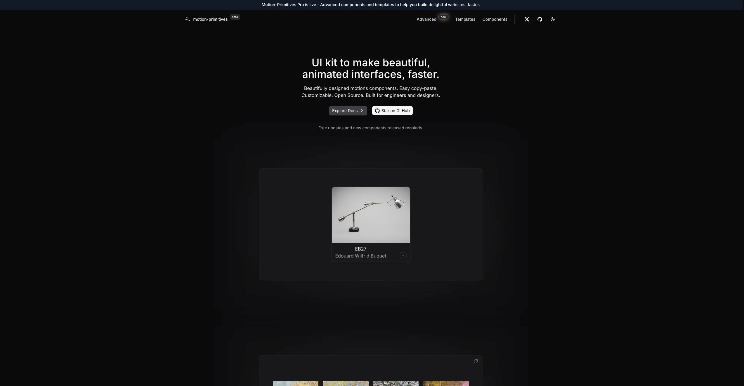
Rating: 7/10
A Framer Motion–forward set of interaction patterns (dock, spotlight, animated toolbars, scroll progress, etc.).
Projects that need delightful motion primitives layered onto existing UI.
Pros
- Smooth, well-crafted animations
- Built on Framer Motion
- Components feel purposeful and focused
- Often installable via Shadcn CLI patterns
Cons
- Smaller surface area vs. full UI kits
- Limited standard UI elements
- Geared toward interactions vs. broad coverage
- Not ideal if you need a comprehensive kit
4) Coconut UI — Wide variety, great motion
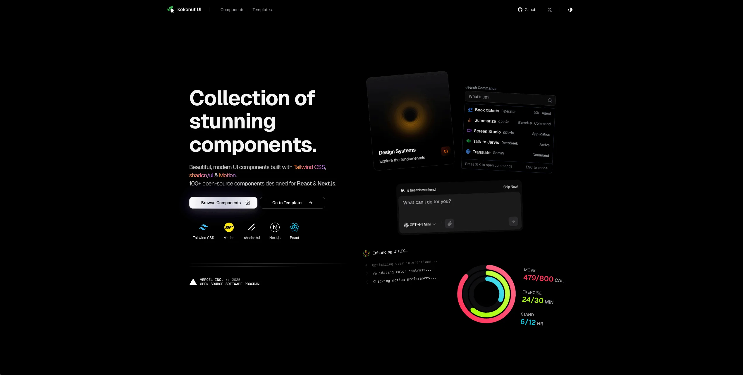
Rating: 9/10
A generous collection spanning simple to advanced components (bento grids, currency transfer flows, AI inputs). Uses Tailwind, Shadcn, and Framer Motion.
Product teams who want breadth with modern motion and are comfortable tweaking advanced components.
Pros
- High-quality and free to use
- Excellent Motion integration and polish
- Wide variety from primitives to complex flows
- Shadcn CLI–friendly setup
Cons
- Advanced animations add learning curve
- Some designs won't fit every brand out of the box
- Heavier motion can be overkill for simple apps
- Complex pieces may need careful customization
5) Smooth UI — Micro-interactions done right
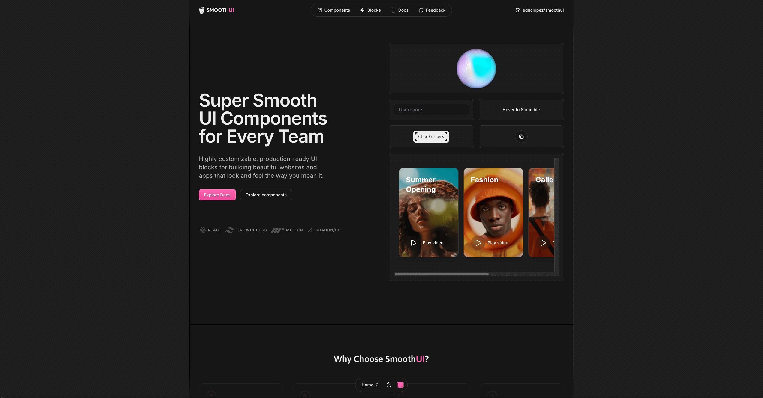
Rating: 8/10
A motion-first kit with dynamic islands, expandable cards, job listing UIs, and a theme selector—all tuned for smoothness.
Teams who want polished micro-interactions without overhauling their whole stack.
Pros
- Excellent, silky animations
- Components are well-crafted and focused
- Useful theme selector
- Clean, well-commented code
Cons
- Smaller catalog than broader kits
- Motion-first, not coverage-first
- Less emphasis on "everyday" components
- Smoothness may be more nice-to-have than need-to-have
6) Cult UI — Practical, performance-aware variety
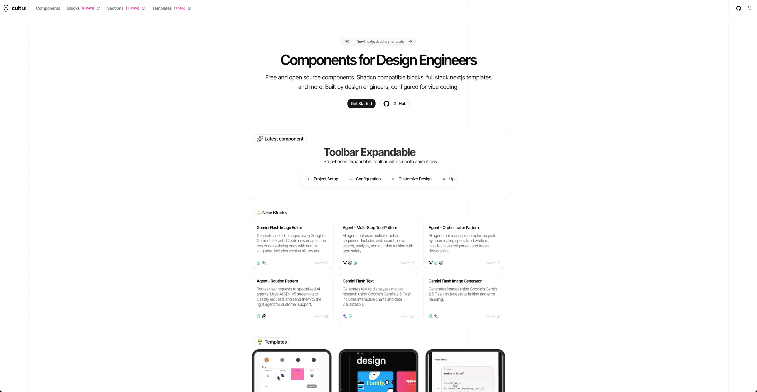
Rating: 8/10
A broad set of components built on Shadcn + Motion: feature carousels, popover forms, dynamic island patterns, YouTube/tweet embeds, and more.
Apps that want "just enough" animation with a wide component menu.
Pros
- Wide-ranging set of components
- Performance-conscious implementations
- Easy Shadcn integration
- Handy media components (e.g., YouTube player, tweet grid)
Cons
- Visual language varies across components
- Might need extra effort to unify aesthetics
- Some designs can feel disparate
- Not for strict, single-style design systems
Subscribe to my Newsletter
Get exclusive tips on freelancing, programming & AI delivered straight to your inbox. No spam, unsubscribe anytime.

7) Origin UI — Consistency without the noise
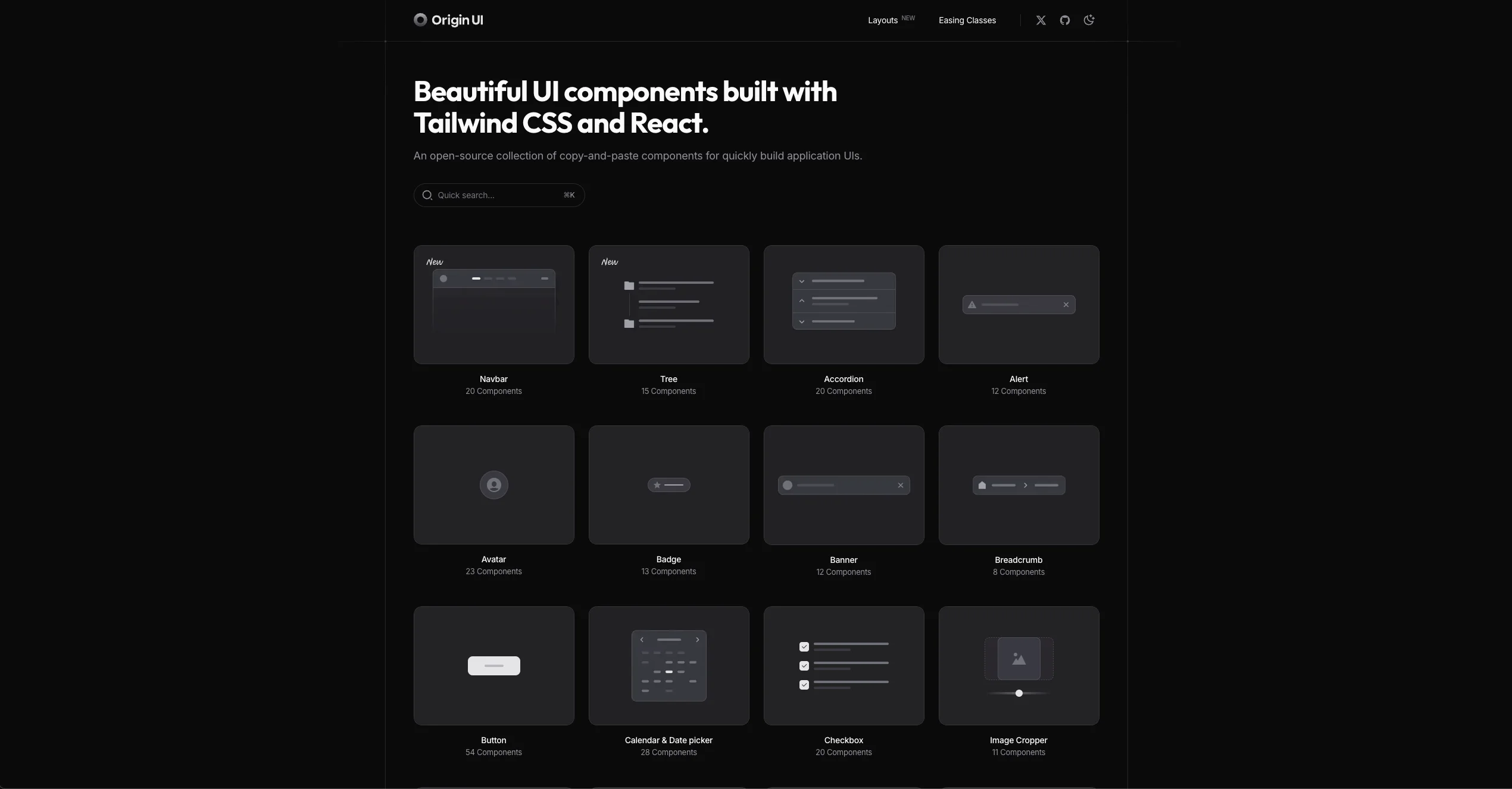
Rating: 8/10
React + Tailwind + Shadcn components with a strong, consistent design language and responsive behavior.
Teams who value cohesion, a11y, and robust basics over flashy motion.
Pros
- Clear, consistent design across the kit
- Responsive, well-considered components
- Good accessibility (ARIA, focus, etc.)
- Includes layouts and templates
Cons
- Minimalist by design; fewer elaborate animations
- Less appeal if you want a highly animated UI
- Fewer complex, experimental components
- Shadcn-first focus may limit style variety
8) MVP Blocks — Ship polished sections fast
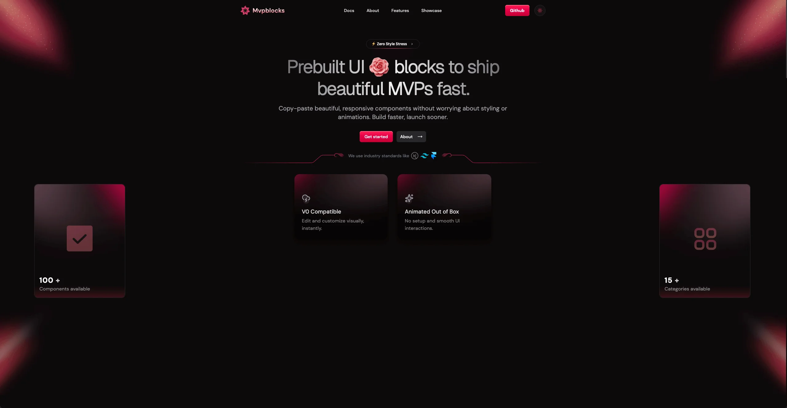
Rating: 9/10
Professionally designed sections—headers, about, pricing, waitlists—animated with Framer Motion and ready for Shadcn projects.
Marketing and product sites where quality animated sections save days of work.
Pros
- Attention to animation detail and design
- Professional-grade sections
- Clean code, straightforward customization
- Installs easily via Shadcn CLI conventions
Cons
- Fewer one-off components; section-first
- Motion adds bundle/runtime weight
- Not ideal if you only need small primitives
- Some integration work for bespoke needs
9) SHSF UI — Tiny set, premium feel
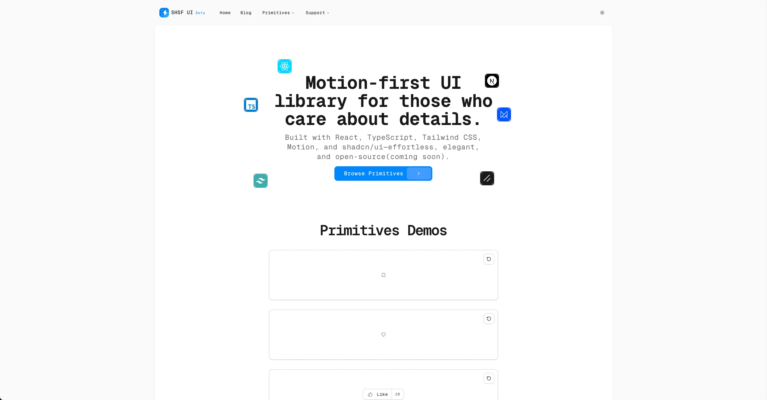
Rating: 8/10
A small but meticulously animated set of primitives (buttons, theme toggles, etc.). Heavy on detail and micro-interaction quality.
Teams who want standout micro-interactions to elevate an otherwise minimalist UI.
Pros
- Very smooth, high-end animations
- Exceptional attention to detail
- Unique primitives (e.g., animated theme toggle)
- High overall quality
Cons
- Limited catalog by design
- Not a full UI library
- You'll need other kits for coverage
- Focused on micro-interactions, not sections
10) KBO UI — Minimal, advanced, consistent
Rating: 9/10
A refined, consistent kit (think Origin UI "pro") with advanced pieces like AI conversation UIs, robust calendars, and custom players.
Product teams who want minimalism without sacrificing capability.
Pros
- Clean, cohesive design language
- Advanced, high-quality components
- Includes standard blocks/sections
- Great balance of minimalism and function
Cons
- Fewer dramatic animations
- Not the choice for flashy UIs
- Some niches may be out of scope
- Opinionated minimalism isn't for everyone
11) Skipper UI — Creative motion with taste
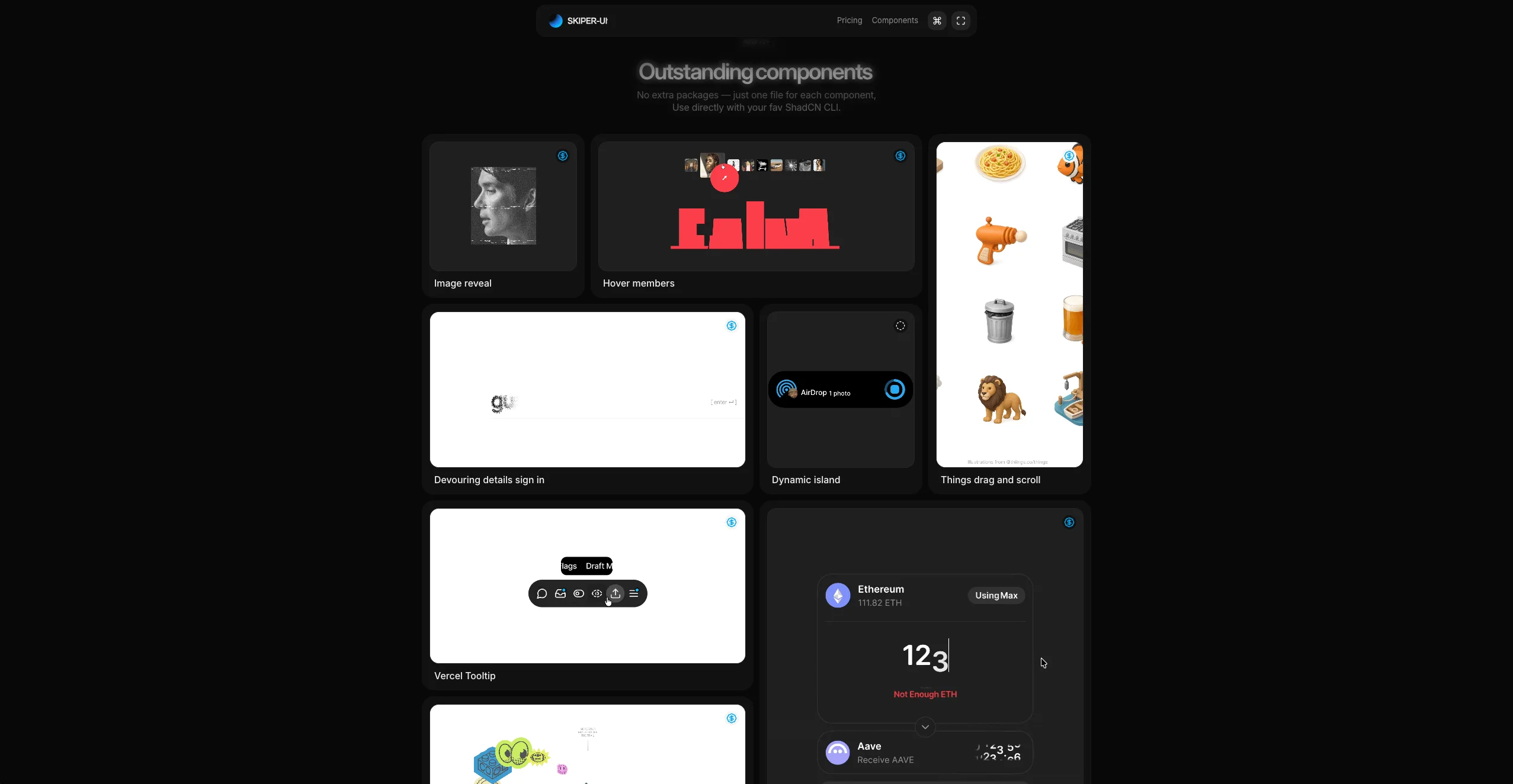
Rating: 9/10
Modern, motion-forward components like card carousels, stacked dialogs, image cursor trails, and distinctive slide buttons.
Apps that benefit from tasteful but noticeable motion (finance flows, confirmations, onboarding).
Pros
- Smooth, well-animated components
- Unique, creative UI elements
- Great for confirmation/flow-heavy apps
- Built with Framer Motion + Shadcn
Cons
- Some flashy pieces aren't universally useful
- Not as many standard UI building blocks
- Specific styles won't fit every brand
- Can be overkill for simple apps
Bonus) Magic UI — Open-source eye candy that ships
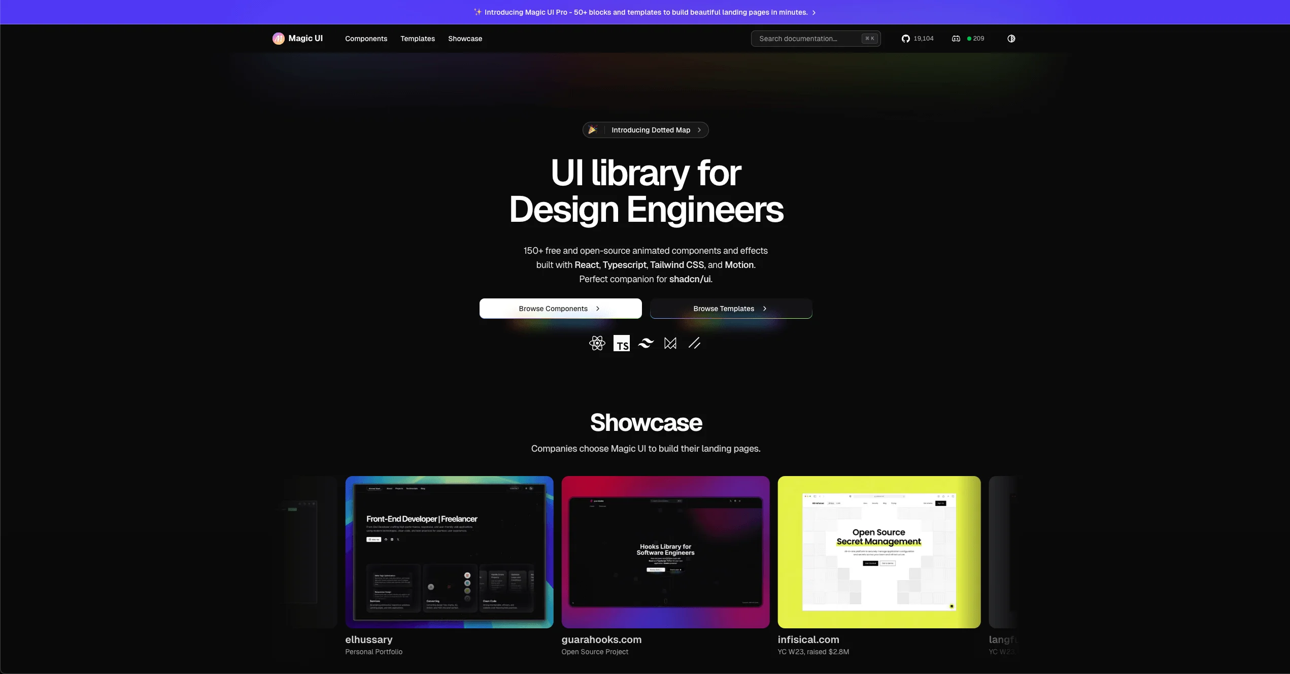
Rating: 9/10
A beloved open-source collection known for visually striking, complex animations. Tailwind + Motion + Shadcn under the hood.
Teams who want free, high-impact components to elevate hero sections, feature reveals, and interactive patterns.
Pros
- Unique, eye-catching components
- Creative use of Framer Motion
- Completely open-source and free
- Simple to integrate into existing projects
Cons
- Highly stylized; may not fit every design system
- Can be complex for simple use cases
- Animation-heavy components can affect performance
- Fewer boring-but-necessary primitives
Quick recommendations
- Fast landing pages: TailArc, MVP Blocks
- Cohesive product UI: KBO UI, Origin UI, Reui
- Motion polish: Skipper UI, Smooth UI, Magic UI (bonus)
- Broad variety on a budget: Coconut UI, Cult UI
- Micro-interactions only: SHSF UI
Choosing the right stack
If your app is product-first, start with a consistent base (KBO UI or Origin UI) and sprinkle motion with Skipper UI or Smooth UI. For marketing work, reach for TailArc or MVP Blocks and ship in hours, not days. Need variety without cost? Coconut UI and Cult UI cover lots of ground. And whenever you want to make a hero or feature section “pop,” Magic UI is an excellent free add-on.
In short: align your choice with the UI surface you’re building right now—pages vs. product vs. polish—and you’ll end up with a stack that ships quickly and looks great.
Need help choosing and wiring these into your codebase?
I can help you pick the right libraries, set up shadcn, wire animations, and leave you with clean, maintainable patterns.

Read more
Dubai's Hidden Gems: Free Coworking Spaces That Rival Premium Memberships
Discover 5 exceptional free coworking spaces in Dubai, from mall hubs to creative galleries. Complete guide with access details, amenities, and insider tips for digital nomads and freelancers.

My Honest Feedback on the Dubai Virtual Work Visa, Two Years Later
Honest review of the Dubai Virtual Work Visa after two years: real pros, cons, costs, and practical insights from a remote worker's experience living in Dubai.

How to Get the Dubai Digital Nomad Visa in 2025
Step-by-step 2025 guide to the Dubai Remote (Digital Nomad) Work Visa: eligibility, documents, application process, renewal insights, costs, and personal year-two experience.